More often than not, a rather hefty amount of work is required to transform and/or aggregate raw data into a form that can be fed into graphical software to yield elaborate visualisations. This, however, doesn’t always have to be the case.
You can make things drastically easier for youself by choosing the right tools. Below are a few popular plotting libraries in Python. This article will focus on introducing how easily they generate informative graphs. The dataset used in the examples is the well known iris dataset.
The graphs in this article were created using this jupyter notebook. You can run it on Binder.
I. Static Graphs
![]()
Seaborn is great for creating elegant graphs with just a few lines of code. It supplies convenient defaults and helper functions that yield rich matplotlib graphics. And it works well with pandas data structures. For example:
import seaborn as sns

iris_data = sns.load_dataset('iris')  # A pandas DataFrame
sns.pairplot(iris_data, hue='species', kind='reg')
In a Jupyter notebook with the matplotlib inline back-end, the output will be displayed as follows:
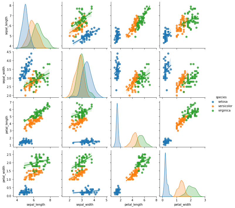
Seaborn automatically selected the numeric columns in the data, colour-coded them by species, and generated linear regression-plots on column pairs. If the goal was to study the relationship between iris sepal and petal dimensions, the graph says it all.
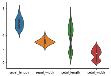
Suppose we were interested in visualising the range of values for each of the columns sepal_length, sepal_width, petal_length and petal_width. This can very easily be achieved with:
sns.violinplot(data=iris_data)
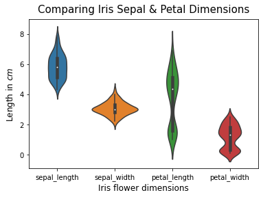
You can customise seaborn graphs using matplotlib:
ax = sns.violinplot(data=iris_data)
ax.set_title('Comparing Iris Sepal & Petal Dimensions', size=15, pad=10)
ax.set_ylabel('Length in $cm$', size=12)
ax.set_xlabel('Iris flower dimensions', size=12)
For more on seaborn, please visit its official documentation and example gallery

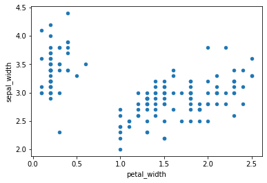
The pandas plotting API allows you to quickly create graphs from within pandas data structures using the .plot method, which is basically a wrapper around matplotlib.pyplot.plot
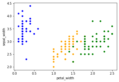
iris_data.plot.scatter(x='petal_width', y='sepal_width')
To produce a scatter-plot with a different colour for each species, we’ll need to map species values to acceptable colour input values. (In seaborn, there’s a handy hue parameter that does this implicitly)
color_dict = {'setosa': 'blue', 'versicolor': 'orange', 'virginica': 'green'}
iris_data.plot.scatter(x='petal_width', y='sepal_width',
                       c=iris_data['species'].map(color_dict))
You can also specify the type of graph to plot by passing any of the following as the kind parameter in the .plot method:
- area
- bar
- barh
- box
- density
- hexbin
- hist
- kde
- line
- pie
- scatter
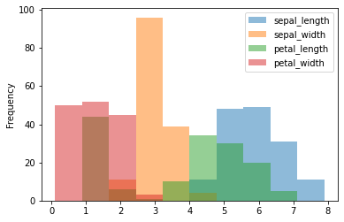
iris_data.plot(kind='hist', alpha=0.5)
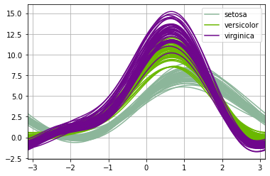
Andrews curves made easy:
from pandas.plotting import andrews_curves
andrews_curves(iris_data, 'species')

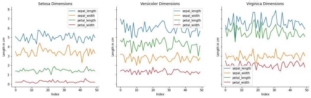
High-level interfaces like Seaborn and pandas are all well and good. But when you need to make unique tweaks or conjure up “distinguished” graphs, you’ll probably need to use good ol’ matplotlib.
This will likely take quite a bit more effort and skill, but the results will be worth it.
import matplotlib.pyplot as plt

fig, axes = plt.subplots(nrows=1, ncols=3, figsize=(18, 5), sharey=True)

iris_species_data = iris_data.groupby('species', as_index=False)

for ax, species_data in zip(axes, iris_species_data):
    species, species_df = species_data
    ax.plot(species_df.drop("species", axis=1))
    ax.set_title(f'{species.title()} Dimensions')
    ax.set_ylabel('Length in $cm$')
    ax.set_xlabel('Index')
    ax.legend(species_df.columns)
    ax.spines['top'].set_visible(False)
    ax.spines['right'].set_visible(False)
II. Interactive graphs
![]()
plotly.py enables you to create spectacular, interactive graphs that can easily be integrated into dashboard apps and websites.
plotly.py is a python wrapper for the plotly.js JavaScript graphing library. You can hover over markers to get tooltips with details, and even zoom in or out of regions of interest.
Like Seaborn, plotly.py works well with pandas data structures.
import plotly.express as px

data = px.data.iris()  # A pandas DataFrame
fig = px.scatter(data, x='petal_width', y='sepal_width', color='species')
fig.show()
Here’s an example from its basic chart example gallery. Try clicking on the inner levels:
import plotly.express as px

df = px.data.tips()
fig = px.sunburst(df, path=['day', 'time', 'sex'], values='total_bill')
fig.show()
Next Steps
For a more comprehensive catalogue of available Python graphing libraries, please visit the PyViz website.
Each plotting library usually provides an example gallery showcasing the graphs it can produce. You could peruse them all to expand your visualisation toolbox.